Color temperature isn’t just a fancy term thrown around in photography—it’s a solid principle that can make or break your photo’s overall vibe. Color temperature refers to the warmth or coolness of the light captured in your image. Think about it like this: that cozy, golden glow during sunset hits different than the stark, bright light at noon. That’s color temperature doing its thing!
You might be wondering why it matters so much. Simple: color temperature can transform the story your photo tells. Warm tones can bring out feelings of nostalgia and comfort, while cooler hues might give off a sleek, modern edge. Getting this balance right is key, whether you’re shooting a landscape or snapping a few casual portraits.
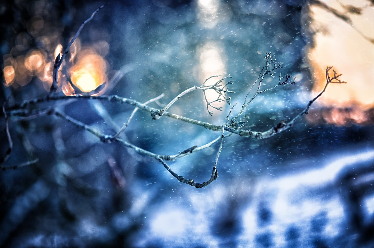
Now, let’s break it down a bit. We often talk about color temperature in terms of warm, neutral, and cool tones. Warm colors usually sit in the lower range of the Kelvin (K) scale and include reds, oranges, and yellows. They’re all about that soft, inviting feel. On the flip side, cool colors like blues and greens are in the higher range, giving off a more crisp, clean look. Neutral tones? They’re the middle ground, helping keep everything balanced without leaning too far toward warm or cool. Don’t forget: picking the right temperature is less about hard rules and more about capturing the right emotion you’re aiming for in your shot.
The Science Behind Color Temperature
When it comes to color temperature, the Kelvin (K) scale is your best friend. It’s how we measure the warmth or coolness of light. Imagine a range starting from a cozy 2,000K, like the soft glow from a candle, to a crisp 10,000K, similar to a blue sky. It helps photographers understand what kind of light they’re working with and how to adjust to get that perfect shot.
Light sources play a huge part in color temperature. Different types of lights, whether it’s natural sunlight or the fluorescent ones buzzing overhead, can shift the temperature and affect your photos in surprising ways. A cloudy sky might push things cooler, while golden hour will heat up the scene with those warm tones we all love.
The environment you’re shooting in also has a say. Consider the heart-emitting warmth of a wood-paneled room versus the cool tones of an office setting with LED lights. Each setting brings its own mood through light. This is why being aware of your surroundings and how they influence light is crucial if you’re looking to nail the color temperature.
Adapting to these changes is where skill and knowledge come in handy. Recognizing the subtle shifts in temperature can guide you in adjusting your camera settings or planning your post-production tweaks. Getting familiar with the science behind it all allows you to capture images that truly reflect what you envision in your mind’s eye.
Color Temperature and Mood: Setting the Scene
Color is a powerful part of storytelling in photography. The temperature of the colors sets the mood and tone before any other factor. Want to create a warm, inviting scene? Use those lower Kelvin temperatures you might find at sunrise or sunset. They’re full of reds, oranges, and yellows that scream comfort and nostalgia.
On the flip side, cooler tones usually found in the higher Kelvins, like a clear midday sky or a softly lit office, can evoke feelings of calm and modernity. These blues and greens lend a sense of detachment or introspection. Whatever mood you’re aiming for, understanding how color temperature influences emotion is super important.
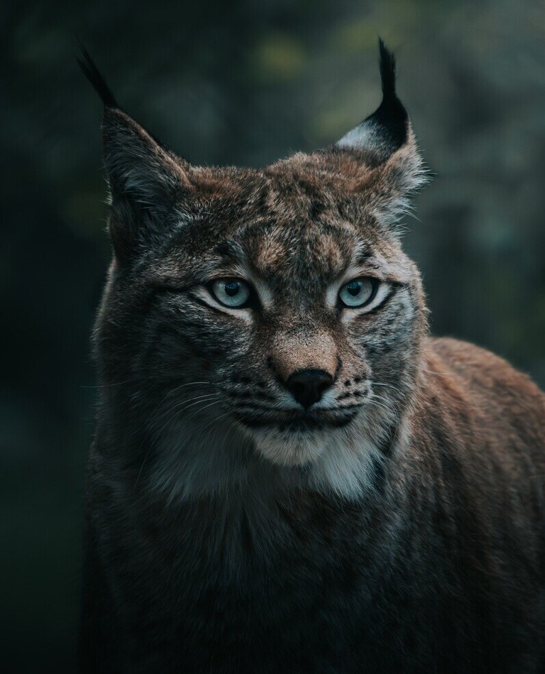
Each photography genre can have its own ideal color temperature. Portraits often benefit from warmer tones to highlight skin textures in a flattering way. Fashion shoots, however, might favor cooler tones to accentuate the modern and sleek designs. Knowing what mood you want to set helps in choosing the right temperature.
The impact of color temperature isn’t just technical—it’s about bringing out the best in your subject and setting. Whether it’s the mystery of a cool, low-light street scene or the vibrancy of a sunlit landscape, the choice of temperature guides the viewer’s journey through your image. It’s almost like directing a film with light.
In practice, setting the right scene isn’t just about what’s aesthetically pleasing. You have to think about what emotional story you’re trying to tell with your photography. Once you’ve got that down, color temperature becomes a tool, like any other, to create something memorable.
Achieving the Right Color Balance: Techniques and Tools
Getting the color balance just right is like hitting the sweet spot in photography. It’s all about taming that color temperature beast using a few handy techniques and tools.
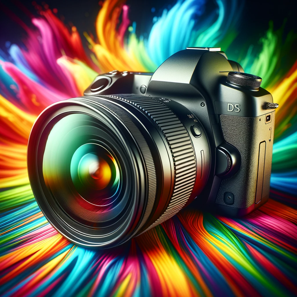
For starters, adjusting your camera’s white balance is a game changer. Modern cameras come with settings that let you switch between different light scenarios like sunlight, shade, and incandescent lighting. But if you want more control, manual adjustment is where it’s at. It allows you to fine-tune colors to precisely match the feeling you’re going for.
Using tools like gray cards or color charts can take things up a notch. They help calibrate your camera to accurately reflect the colors you’re seeing in real life. Think of it as setting a baseline for your camera to adjust from, ensuring your warm oranges don’t turn into an overpowering red.
Let’s talk post-processing. Whether you’re editing with software like Lightroom or Photoshop, making those final color tweaks can correct any mismatches from the shoot. Adjusting sliders for warmth, tint, and white balance can transform your image into something that fits your vision just right.

Keeping an eye on these elements and blending them as needed makes you versatile in managing any light condition you shoot in.
It’s more than just a technical process; it’s about refining the details until the photo feels “just right.” By mastering these methods, you’ll create photos that not only capture your subject but also convey the story you set out to tell.
Choosing the Right Color Temperature for Your Photos
Picking the perfect color temperature depends a lot on where and what you’re shooting. Let’s face it, light changes everything, especially when you’re snapping pictures either indoors or outdoors.
For outdoor photography, nature itself plays into the color game. During the golden hour, warm hues soak over everything, making it a great time for portraits and landscapes. But if you’re shooting at midday, shadows are harsher, and the colors drift toward the cooler side. These conditions call for balanced adjustments to your camera’s settings to capture what you see.
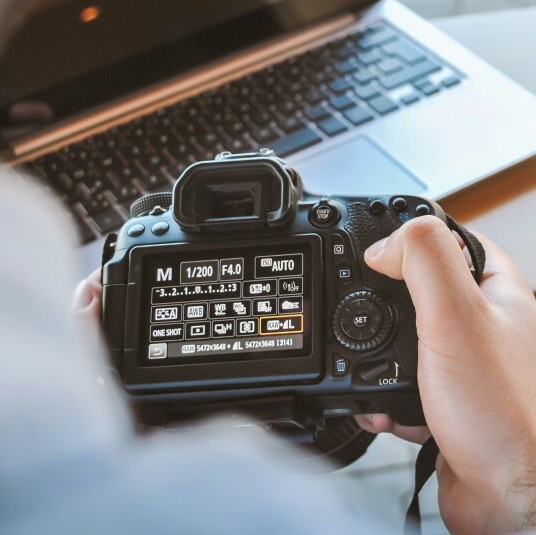
Indoors, the artificial lighting throws another layer of complexity into the mix. Yellowish tungsten light adds warmth, while fluorescent bulbs might make things too cold. Here, setting your white balance correctly can turn an average shot into something more true to life.
Then there’s the matter of mixing natural light with artificial. This can be tricky, especially when the warmer indoor light clashes with cooler natural light coming through a window. The trick is to find a middle ground or decide which mood you want most pronounced and adjust accordingly.
Keep an eye out for common pitfalls. Sometimes, you want a nice, warm photo, and it comes out looking more orange; this usually means you need to adjust your white balance. Or maybe a cool-toned picture ends up looking too blue, and you’ll need to adjust your settings to bring back the natural tones.
Choosing the right temperature is never just a one-off decision. It’s about adapting to the environment you’re in and the emotion you’re trying to convey, with a bit of experimenting along the way. Once you start recognizing these patterns, you’ll be well on your way to snapping photos that truly hit the mark visually and emotionally.
Professional Tools to Manage Color Temperature
Aspiring to elevate your photography game? Check out these essential tools that can boost your color temperature control. First up, color gels. These flexible sheets come in various colors and can be used to modify the light source in your scene. They help add warmth or coolness exactly where you need it, offering creative freedom in both shooting and post-production.
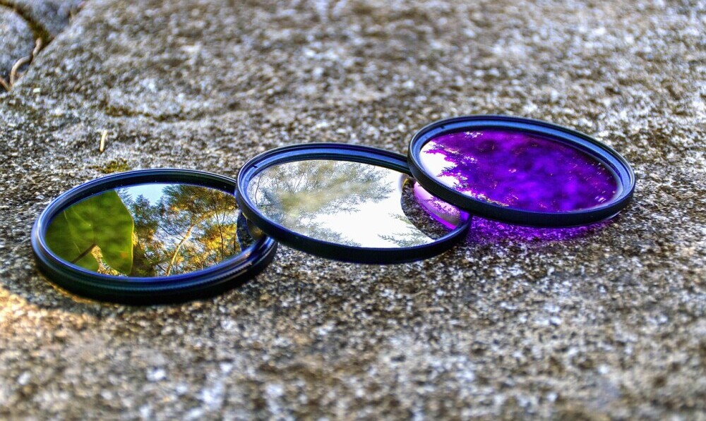
Another must-have is a good set of filters. Attachable to your camera lens, these can adjust the incoming light, sometimes warming it up or cooling it down, without needing to alter the scene itself. Essential for outdoor photographers, these can save you from harsher midday lights.
Light meters are another tool that can help bridge the gap between guessing and knowing. By measuring the light intensity as well as its temperature, you can make smarter decisions about your setup before you even click the shutter.
When it comes to post-processing, there’s an array of software tools ready to help you nail that perfect balance. Programs like Lightroom offer sliders for temperature and tint, which can refine the mood of your photo from subtle shifts to dramatic changes.
Exploring case studies can also expand your toolkit. By learning from other photographers who excel in temperature management, you gain insights into practical applications and unique uses for these tools. These examples show how non-traditional approaches can sometimes yield surprising results.
Whether you’re using hardware like gels and filters or software for post-processing, professional tools enhance your ability to control every aspect of your image. It’s about having these options at your fingertips to adapt to any challenge, ensuring that no matter the scene, your color temperature is spot on.
Case Studies: When Color Temperature Makes a Difference
Stories of successful photography often hinge on mastering color temperature, showing how it can transform a seemingly ordinary scene into something unforgettable. Take, for example, a landscape photographer who shifted his approach to capture the varied hues during different light conditions. By adjusting the color temperature, he was able to bring out the rich textures and depths in his work, making each image a vivid journey through natural beauty.
Chatting with a portrait photographer gives another insight. In one specific project, she shared how tweaking the color temperature highlighted her subject’s skin tones perfectly under fickle lighting conditions at an outdoor shoot. This small change brought warmth and life to the photos, earning rave reviews from her client.
Diving into urban photography, one pro tackled the issue of mixed lighting in cityscapes. By using creative adjustments in post-production, he resolved color clashes between street lights and building interiors, turning chaotic scenes into harmonized compositions full of stories.
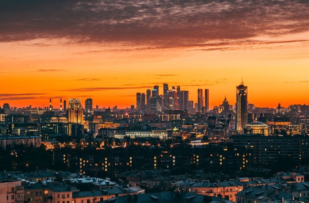
These examples highlight why color temperature is not just about getting the technical aspects right but also about enhancing the narratives conveyed through photos. Photographers often reflect that understanding these nuances allowed them to elevate their creativity, opening platforms for new artistic expressions.
Takeaways from these successful strategies show that diligence in color temperature management can significantly elevate the quality of your work. It allows photographers, whether they are newcomers or seasoned pros, to craft images that resonate, strike a chord, and engage viewers in the visual story being told.

This article brilliantly captures the significance of color temperature in photography and offers actionable insights for photographers of all levels. The breakdown of how warm, neutral, and cool tones can influence the mood of an image is incredibly helpful. As a photography enthusiast, I’ve seen firsthand how color temperature can alter the story an image tells—whether it’s creating a nostalgic warmth in a sunset shot or the clean, crisp look of a daytime landscape.
I particularly appreciate the discussion on tools like color gels, filters, and light meters. They’re essential for achieving that perfect balance, especially when natural and artificial lights mix indoors. One question I have is about managing mixed lighting in fast-paced settings, like events where lighting sources vary constantly. Do you have any tips for quickly adjusting color temperature in these environments? Thank you for the comprehensive guide! It’s a great resource for photographers aiming to enhance their storytelling through color.
Thanks for the great feedback! Mixed lighting at events can definitely be challenging. A quick tip is to shoot in RAW if possible—it makes it easier to adjust color temperature in post. Also, using a gray card or setting a custom white balance can help if you have a moment between shots. And when things are really fast-paced, sometimes using a warmer or cooler preset and tweaking it later can save you time. Glad you found the guide helpful!